
Accessible Macrons
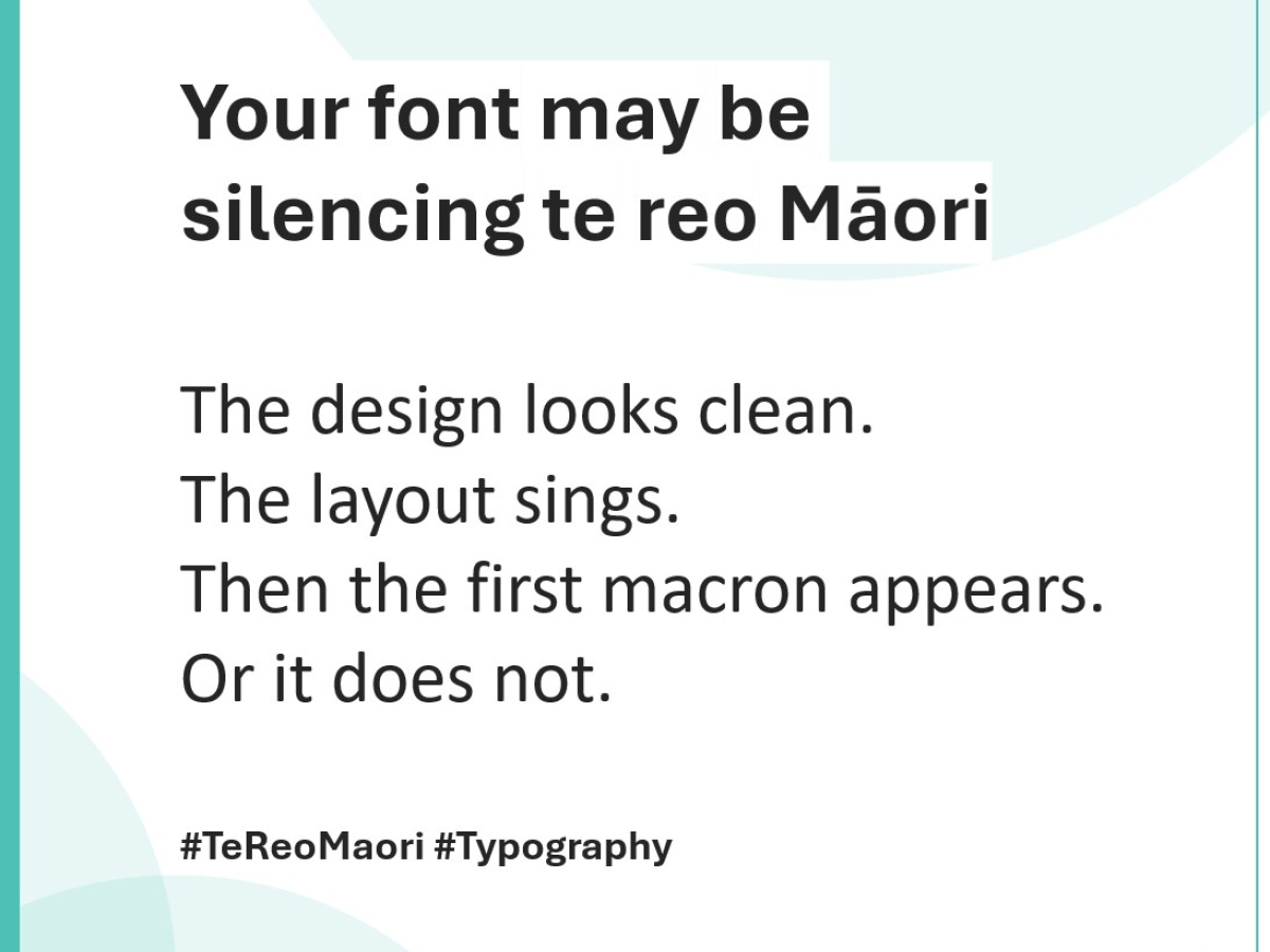
Your Font Might Be Silencing Te Reo Māori
Most designers obsess over the usual suspects when choosing a font: size, weight, shape, spacing, readability. But here in Aotearoa, there’s another question that carries cultural weight far beyond aesthetics.
Does your font actually support te reo Māori — or is it quietly erasing it?
You might not notice at first. The design looks clean, the branding feels right, the layout sings. But then the first word with a macron appears. Or rather, it doesn’t. The ā, ē, ī, ō, ū your te reo content relies on are missing, replaced with broken glyphs, awkward workarounds, or most damaging of all, unmarked vowels that change the sound and meaning of the kupu entirely.
Suddenly, your typography isn’t just a design flaw. It’s a barrier to language, identity and understanding.
Macrons Aren’t Optional — They’re Essential
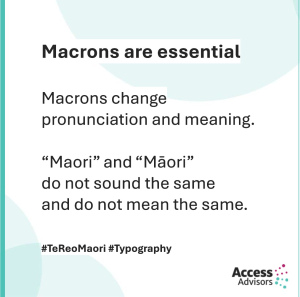 Te reo Māori deserves to be represented with accuracy, dignity and care. That starts with macrons. They’re not decorative, they change pronunciation and meaning. “Maori” and “Māori” don’t sound the same, don’t mean the same, and don’t carry the same respect.
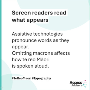
A missing macron can turn a familiar word into something unrecognisable — for readers and for screen readers. Assistive technologies pronounce words as they appear, so omitting macrons isn’t just a writing issue; it directly affects how te reo Māori is spoken aloud in digital spaces. For many users, that’s the difference between clarity and confusion.
The Technical Aspect Designers Often Overlook
You can choose a beautiful font, but if it doesn’t include macron support, it’s the wrong font. Many typefaces fail this basic test. Some display macrons inconsistently, misalign them, or replace them with fallback characters that break the flow of the page. Others simply don’t support them at all.
We also need to be aware that te reo Māori words tend to be longer than their English 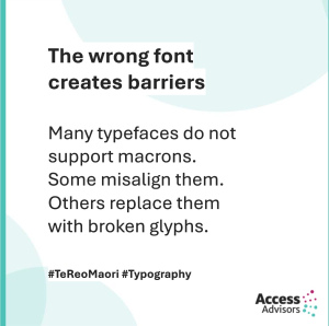 counterparts. That means text wraps differently, spacing needs more breathing room, and headings sometimes require rethinking. A font that looks sharp in English may suddenly feel cramped or unbalanced once te reo is added. Without planning for this, line breaks and wrapping can fall apart.
Accessibility isn’t just about legibility. It’s about cultural and linguistic inclusion.
Developers Need to Play Their Part Too
For developers, supporting te reo Māori well isn’t just a matter of swapping in the right font, it’s about building systems that treat the language with the same care and precision we expect for English. That starts with handling macrons properly.
Your code needs to store, serve and display them without breaking, which means using Unicode endtoend and avoiding any processes that strip or “simplify” characters behind the scenes. Different platforms generate macrons in different ways, so if you’re comparing or sorting text, you’ll want to make sure it’s normalised so ā means ā everywhere in your system.
Webfonts need just as much scrutiny: many popular ones don’t include the full set of macronised vowels, and overly aggressive font subsetting can accidentally remove them. Even fallback fonts matter. For example, when your primary font doesn’t load, those macrons still need to appear, not vanish.
Marking up content correctly with lang="mi" also helps screen readers pronounce kupu Māori properly, and embedding fonts in PDFs or SVGs prevents broken characters when files travel between devices.
Thoughtful development ensures te reo Māori is spoken, seen and understood the way it should be, with clarity, accuracy and respect.
Testing Matters Especially With Screen Readers
 If your organisation uses or publishes te reo Māori, testing isn’t optional. Try reading your content with NVDA or VoiceOver. Listen to how the macron changes the rhythm and clarity of kupu. Then remove the macron and hear the difference.
You’ll never go back.
Choosing Fonts That Uphold the Mana of Te Reo
The fonts you choose send a message about what and who you value. A font that supports te reo Māori tells your audience that the language is important, that it belongs in your digital spaces, and that you are willing to treat it with care.
A font that doesn’t? Well… that sends a message too. Before choosing a font, type these five kupu: ā, ē, ī, ō, ū.
Ready to Choose a Font That Truly Includes Everyone?
At Access Advisors, we help organisations build digital experiences where te reo Māori, accessibility and great design sit side by side. If you’re reviewing your typography, creating bilingual content, or simply want to make sure your font choices reflect the values of Aotearoa, we’d love to support you.
Get in touch with us — let’s design digital spaces where te reo Māori is seen, heard, and respected.
Quick Font Checklist for Te Reo Māori Support
-
Does the font include ā, ē, ī, ō, ū?
-
Do they line up correctly?
-
Do they work in headings, body text, buttons and forms?
-
Does the fallback font display macrons?
-
Are webfonts subset safely (not deleting macron characters)?
-
Is lang="mi" used where needed?
-
Have you tested with VoiceOver or NVDA?
Read our previous blog in this series