
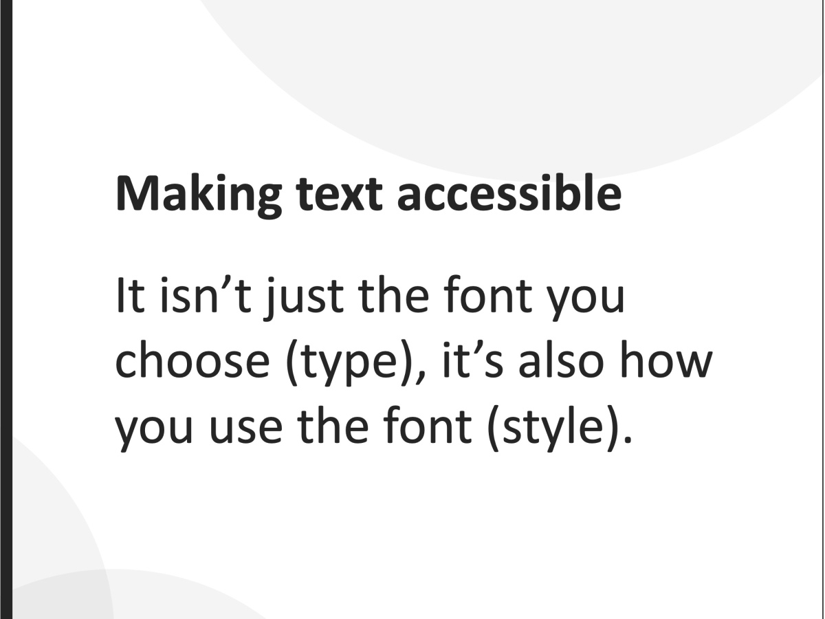
Font type isn't the only access issue
The problem isn’t just the font you choose, it’s also how you use it.
Designers love fonts. We all have favourites, we all have strong opinions, and we all get a little spark of joy when we find the perfect one for a project. But after years of doing accessibility reviews at Access Advisors, we’ve noticed something important: font problems don’t only come from the font family itself. They often come from the way the font is used.
We regularly see beautiful designs become difficult, tiring, or even impossible for people to read. It’s not necessarily because the font is wrong. It can also be because the designer didn’t think through how people actually read.
There are design decisions that matter after you’ve chosen your font. The decisions that determine whether people feel welcomed by your content… or shut out by it.
Poor font use affects more people than you think
Bad typography doesn’t just affect “edge cases” or “niche users.” It affects huge portions of the population, often in everyday, ordinary situations. This includes people:
-
with low vision, who rely on clear shapes, good spacing, and readable sizes
-
who are older adults, who often face reduced contrast sensitivity and changes in depth perception
-
with dyslexia or other reading difficulties, who rely on predictable word shapes and consistent structure
-
with ADHD, brain fog, or cognitive fatigue, who need content that doesn’t drain attention
-
who are stressed, tired, distracted, or under time pressure, nearly everyone at least some of the time
-
using mobile phones outdoors, where glare and small screens reduce clarity
-
reading in a second language, who already work harder to decode text
-
who rely on their glasses, or anyone who ever loses or forgets their glasses
When fonts are used well, these people, your real audience, feel supported. When fonts are used poorly, they face barriers before they’ve even started reading. Typography sets the tone for inclusion long before the content does.
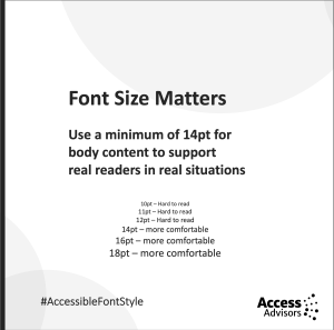
Font size needs to support real readers
 One of the most common questions we get is, what size font should we use. And one of the common issues we see is that text is often just too small for many of us to see.
W3C recommends a base text size of around 16px (roughly 12pt) for browser defaults. But this assumes ideal conditions: perfect eyesight, no glare, a large screen, full concentration, and English as a first language. Those conditions don’t reflect real life. For body text in documents, PDFs, and many digital interfaces, a minimum of 14pt usually offers a more comfortable experience.
Small text makes reading harder for people and this is unnecessary. And the people who struggle the most are usually the ones who need your information the most. Design shouldn’t exclude people because they’re not willing to squint.
Sans serif fonts reduce friction
The serif vs sans serif debate has been going on for decades. Serif fonts (like Times New Roman or Georgia) have decorative strokes at the ends of letters. Sans serif fonts (like Arial, Helvetica, or Calibri) don’t.
On paper, serif fonts can work well. But in digital environments, sans serif fonts tend to perform better because:
-
the letterforms are simpler
-
the shapes are clearer at small sizes
-
there’s less visual clutter
-
they render more consistently across devices
Users regularly tell us serif fonts feel busy or grainy on screens — especially for older people and those with dyslexia or visual processing differences. Reducing friction isn’t about removing personality. It’s about giving readers the best chance of success.
Sentence case supports natural reading patterns
Sentence case is our normal default write style. But it is often dismissed as dull. 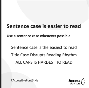
But it’s actually the most readable form of text for most people. That’s because our eyes recognise word shapes, not just individual letters. These shapes come from ascenders (d, h, l, b) and descenders (g, p, y), which create a flowing rhythm.
Sentence case makes the most of this natural pattern. When you use Title Case or ALL CAPS:
-
Title Case disrupts the rhythm
-
ALL CAPS removes ascenders and descenders entirely
We see this all the time in testing. People slow down, re-read, or skip headings because the shapes look too uniform. Sentence case isn’t plain, it’s efficient and familiar and easy.
ALL CAPS creates visual noise
Capital case or ALL CAPS is often overused, especially in headings, banners, calls to action, and even whole paragraphs. ALL CAPS feels shouty because all letters sit at the same height, forming dense, uniform blocks. This makes words harder to scan, slows reading, and increases mental effort.
Many designers use ALL CAPS to create emphasis. What it actually creates is visual noise. When everything is emphasised, nothing stands out. A heading doesn’t need to shout to be clear, it just needs to be readable.
Bold text should be used intentionally
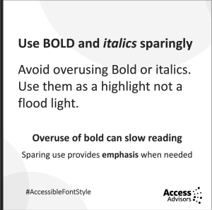 Another tool to create emphasis is to use bold text. Bold is useful in small moments. But large blocks of bold text feel heavy, visually crowded, and tiring to read.
Another factor that is often overlooked is how screen readers announce bold text. Depending on the software and user settings, a screen reader may say “bold” before and after every bold word or phrase. That means:
-
too much bold slows reading
-
bold-heavy sentences become choppy
-
emphasis becomes distraction.
Better ways to emphasise content include:
-
breaking up long paragraphs
-
using clear headings
-
adjusting spacing
-
using layout and hierarchy.
Bold works best as a spotlight, not a floodlight. Use it wisely and try different ways to emphasise content.
Consistency builds trust and clarity
One of the strongest accessibility tools is simple consistency. When fonts change size, weight, colour, or style without clear purpose, people lose the thread. Inconsistent typography forces readers to re-interpret meaning again and again. 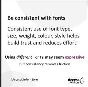
When your typography behaves reliably, readers understand the structure instinctively. They know what’s important, where to go next, and how to interpret your message. Consistency removes friction, and that’s what accessible design is all about.
Too many fonts create unnecessary effort
When doing reviews of websites, one of the most frustrating issues is the use of lots of different fonts and styles. Using lots of different fonts or styles might feel expressive, but it creates extra mental load. Readers must constantly adjust to each shift, and that slows everything down.
Every new font brings different shapes, spacing, rhythm and expectations which each need processing. Good typography supports reading. It doesn’t complicate it.
Great typography is invisible
Typography isn’t decoration. It’s a core part of how people access information. The choices you make about size, case, weight, spacing, and consistency determine whether your content feels effortless or obstructive.
At Access Advisors, we’ve seen again and again that the designers who think about readability are the ones whose messages land the best. Accessibility isn’t about compromise, it’s about clarity.
Kōrero mai – Reach out
Good typography is a powerful tool for inclusion. When you get it right, your message lands clearly and confidently with every reader.
If you want support to make your typography, design system, or content more accessible, the team at Access Advisors is here to help. We work alongside you to understand your real audience, remove hidden barriers, and design experiences that welcome everyone. We can:
-
review your typography, layouts, and content
-
test your designs with real users, including disabled people
-
guide your designers, writers, and developers to make good, practical decisions
-
train your team so accessibility becomes part of everyday practice
Kōrero mai - Get in touch, we’d love to support you.
Quick Check List
-
Use a minimum of 14pt
-
Only use sans serif fonts
-
Use sentence case where possible
-
Avoid CAPITAL CASE
-
Avoid overuse of italics
-
Avoid large blocks of bold text
-
Use fonts consistently
-
Avoid lots of different fonts and styles