
What events can teach us about digital accessibility
Accessibility is not just about ramps, screen readers, or colour contrast. It is about reducing effort so more people can take part, whether they are attending an event, using a website, filling in a form, or trying to read a slide deck. The small choices we make early can turn a barrier into a better experience for everyone.
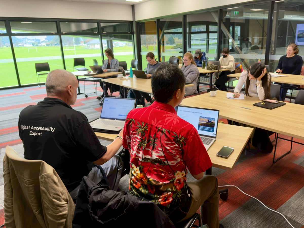
The team have just finished running community training around the motu, helping almost 100 people learn the basics of digital accessibility. and not long after I found myself at a business networking event. During these events, as often happens when you spend your life thinking about access, I noticed a few access issues.
I noticed the lighting. The seating. The timing. The noise. The exits. The PowerPoint slides that made my brain do that tiny internal scream.
None of these things were dramatic on their own. But together, they reminded me how much access is shaped by the small choices we make before people even arrive. It is exactly the same in digital accessibility.
Accessibility is not just ramps and screen readers
When people hear ‘accessibility’, they often jump straight to ramps, wheelchair spaces, screen readers, or colour contrast. Those things matter. Very much. But accessibility is wider than that.
Accessibility is about whether people can take part without having to spend all their energy managing the environment and barriers around them.
As a neurospicy accessibility consultant, I am very aware of this. The classic event setup of “sit down, be quiet, and act professional for an undefined period of time” is hard for me. I can sit still for a while. Then I need to fidget, stand, stretch, shift position, or do something with my hands so my brain can keep paying attention.
In our community training sessions, we told people they were welcome to stand, move around, step out, sit differently, or do what helped them stay present. And yes, they saw me up and down and up and down too. Supportive vibes, not statue vibes.
The digital version is the same idea. Do not assume everyone will use your website, app, form, or document in one neat, focused, uninterrupted way. People may be tired, distracted, in pain, anxious, overwhelmed, using assistive technology, on a small screen, or trying to complete something quickly between other life things.
Lighting, contrast, and the effort of looking
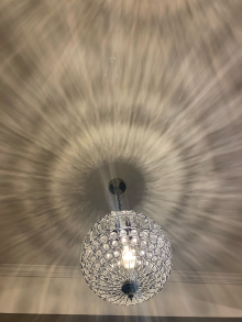 Bright neon lighting can be harsh, especially for people with light sensitivity, migraine, concussion, sensory processing differences, or low vision. Big flashy ballroom type lights can be distracting. During our training, two people at different events wore caps to help reduce the glare. In some rooms, we lowered the lights a little. Not so much that everyone gently slid into nap mode, but enough to make the space easier to be in.
Digitally, lighting becomes contrast, brightness, movement, and visual clutter. If text is low contrast, too small, placed over a busy image, or surrounded by flashing and moving content, people have to work harder just to read the thing you want them to read. People need to be able to notice it, use it, understand it, and rely on it.
Big flashy ballroom type lights in a venue can be distracting.
Seating, layout, and options
People come in different shapes, sizes, bodies, energy levels, pain levels, and sensory needs. Event chairs are often too tall for me to sit with my feet flat on the floor. They can be uncomfortable. Movable chairs can feel unstable. Rows can be packed so tightly that fidgeting feels like a public service failure.
Lecture-style seating with no desks can also make it hard. I am listening to the speaker, but I might also be taking notes, checking something, or doing another small task that helps me stay focused. If there is nowhere to rest my laptop, drink bottle, or energy drink, the whole thing becomes harder than it needs to be.
Digital design has seating too. It is the layout. It is whether a page gives people space to focus, whether buttons are easy to find, whether forms are broken into manageable steps, and whether people can choose the way that works best for them.
If your digital service only works for someone who is calm, focused, confident, using a mouse, on a large screen, with plenty of time, then it is not designed for real life. It is designed for an imaginary user with an unusually peaceful day. Lovely for them. Not so useful for everyone else.
Breaks, timing, and cognitive load
When we asked people about access needs before our training sessions, regular breaks came up often. Breaks are not a luxury. They help people manage pain, fatigue, focus, medication, anxiety, sensory overload, and the very normal human need to go to the toilet without missing half the session.
Online, the same idea shows up as cognitive load. If a website asks people to read dense pages, remember information from three screens ago, complete long forms without saving, or respond before a timer runs out, it is creating the digital version of a three-hour session with no break.
Good digital accessibility reduces effort. It uses clear language, sensible headings, helpful error messages, enough time, predictable steps, and options to pause, save, go back, or ask for help.
Exits matter
At the networking event, the exits were all at the front of the room by the stage. There was no subtle way to leave. I did not need to leave, but I needed to know that I could. Knowing there is an exit can be enough to stay. Knowing there is not one can make your nervous system start doing interpretive dance.
In digital design, exits are things like a clear back button, a cancel option, a way to review before submitting, and reassurance about what will happen next. People should not feel trapped in a process or worried that one click will cause a problem they cannot fix.
Noise, temperature, and designing for variation
 Noise is another one. It does not bother me as much as some other things, but at one of our training sessions the air conditioning made it hard to hear the presenters. For some people, background noise is tiring. For others, it can make speech almost impossible to follow.
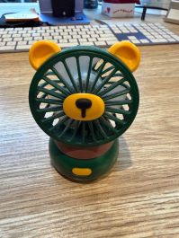
Temperature is similar. I am almost always too hot and often have a USB fan sitting on my laptop. Other people feel the cold. In a big room, you will never get it perfect for everyone, but you can notice the issue and offer choices where possible.
Digital services also need to allow for variation. Some people need captions. Some need transcripts. Some need keyboard access. Some need fewer distractions. Some need plain language. Some need more time. Some need all of the above on a Tuesday afternoon after a terrible sleep and three meetings too many.
Please, please make your presentations readable
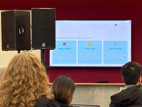
The biggest issue I notice at events, and the one that always makes my brain itch, is how often the presentations are hard to read. Poor colour contrast. Tiny text. Too many ideas on one slide. Important information shown only in a graph that is never explained. Beautiful layouts that look clever but do not communicate clearly.
At the networking event, someone mentioned artificial intelligence tools that can create beautiful graphic presentations. And sure, beautiful is nice. But if the slide is not readable, understandable, and usable, it is not doing its job. Pretty but inaccessible content is still inaccessible content.
This is true for websites too. A gorgeous website that people cannot navigate, read, understand, or complete tasks on is not a great website. It is a very polished barrier.
Turning this into action
Whether you are planning an event, building a website, creating a form, sending a newsletter, or designing a slide deck, access should be considered early. Not as a panic patch at the end. Not as a legal tick-box. Not as “we will deal with it if someone complains”.
Accessible design usually comes down to thoughtful basics:
-
Give people clear information before they need it
-
Make the environment, page, or process easy to understand
-
Offer choices where you can
-
Do not rely on one way of seeing, hearing, moving, reading, or thinking
-
Reduce unnecessary effort
-
Make it easy to pause, leave, return, correct mistakes, or ask for help.
And here is the lovely part: these things do not only help disabled people. They help almost everyone. Clear slides help tired people. Captions help people in noisy places. Plain language helps busy people. Good contrast helps people outside in bright light. Predictable forms help people who are stressed, distracted, or not feeling especially blessed by the universe that day.
A good access question to ask
Before your next event, website update, form redesign, or presentation, ask: Who might find this harder than it needs to be, and what could we change now to make it easier?
That one question can shift the whole approach. It moves accessibility from compliance to care. From fixing problems to preventing them. From assuming people will cope to designing so they do not have to work so hard in the first place.
That is the whole point. Accessibility is not about making things special for a small group of people. It is about making things work better for humans. Messy, varied, wonderful humans with different bodies, brains, devices, needs, and days.
Kōrero mai
If this has sparked a thought about your own website, forms, documents, slides, or events, we would love to hear from you. Reach out to Access Advisors and let’s chat about making things easier for more people.