
Digital Accessibility and Canva
Canva has become one of the most widely used design platforms in New Zealand, helping people create everything from social media graphics to reports and presentations. It offers real benefits, making design more accessible to non-designers and enabling people to create professional-looking content quickly.

For disabled people, accessibility is not optional. It affects independence, education, employment, communication, and participation every day. For practitioners and accessibility professionals, this matters because widely used tools shape everyday communication.
Canva has made significant improvements to accessibility and can support screen reader users through features such as alternative text, screen reader language settings, heading tags, reading order in PDFs, accessibility checking, and colour contrast tools.
However, it still has limitations when it comes to creating fully accessible documents. Complex layouts, multi-column designs, tables, decorative text effects, and text embedded within images can cause problems for screen readers, while reading order and document structure may not always be interpreted correctly. Here are a few other areas we think could be fixed.
Keyboard navigation can be inconsistent
Many people do not use a mouse to access technology. Instead, many rely on keyboards only, switch devices, voice control, or other assistive technology. In Canva, focus can jump unexpectedly, menus can be hard to get out of, and some controls are still difficult to use without a mouse. This can leave users stuck or unsure where they are.
Screen reader support is still challenging
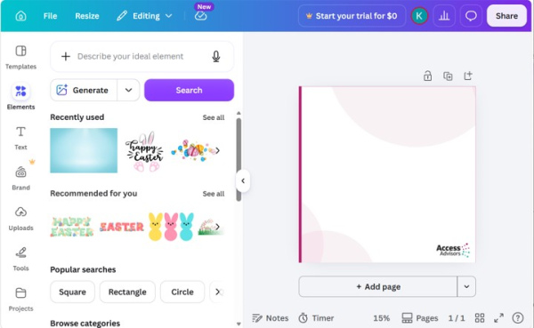
Canva’s interface includes many icons, floating panels, and editing controls. When labels for icons, controls etc. are unclear or the context is missing, users may hear repeated terms like “button” without knowing what the control does. That makes simple tasks slow and tiring.
More consistent labelling of controls, icons, and panels would make navigation significantly easier for screen reader users.
The interface can become visually overwhelming
Built around a busy visual interface, Canva’s side panels, animations, recommendations, and moving elements can make the screen hard to process. For people with neurodivergence, this level of visual activity can be overwhelming.
Many other design tools have a similar crowded interface, so this isn’t just a Canva issue.
Drag-and-drop design creates accessibility barriers
Much of Canva’s workflow depends on dragging and placing items on a page. This creates barriers for keyboard-only users and many other users of assistive technologies. Without strong alternatives, many users cannot fully participate in the design process.
Providing robust keyboard alternatives to drag-and-drop interactions would make the design process more accessible.
Focus management can break during editing
Focus management, or more simply where the focus moves to and how it is visible, is an essential part of digital accessibility, especially in complex web apps. In Canva, focus does not always move predictably across templates, text boxes, uploads, and settings. For assistive technology users, this can be confusing and disruptive. Even sighted people can become confused if the focus moves in a way that doesn’t make sense.
Accessibility can feel secondary rather than foundational
Many practitioners see Canva as a product designed first for sighted mouse users, with accessibility added later. This matters because accessibility works best when it is part of the product from the start. When it is treated as an add-on, support is often uneven, and users are left to find workarounds.
Templates can unintentionally encourage inaccessible content
Inaccessible templates can also spread poor practice. Many of the templates available in Canva include low colour contrast, small text, decorative fonts, text over busy images, or meaning shown by colour alone. When people reuse these layouts in schools, workplaces, and public communication, inaccessible content becomes normalised.
Providing a larger range of accessibility-reviewed templates would help reduce the spread of inaccessible design practices and encourage better outcomes for everyone.
Screen magnification can be difficult to use
Low vision users often use device zoom controls or use screen magnification software that makes everything bigger so they can see. In Canva, sidebars and floating controls can take up a lot of space at high zoom levels. Users may need to pan constantly just to find tools and continue working, which increases effort and fatigue.
Ideally, there should be ways for people to choose what and when elements change.
Real-time collaboration can create confusion
Canva provides real-time collaboration between designers which is a useful feature. But it can also add confusion, especially for people who are neurodivergent. Moving cursors, live updates, and notifications can interrupt screen readers and make it harder for users to stay oriented. In an already complex interface, that adds extra mental effort.
New features can arrive faster than accessibility improvements
Like any modern business, Canva releases new AI features and interface changes regularly. Fast updates can be good, but accessibility testing does not always seem to keep pace. This can leave gaps in new tools, long-running bugs, and frequent workflow changes for users who depend on consistency.
We know they are working on it, but accessibility testing should be part of their release process, not a nice to have.
Why this matters
Digital accessibility shapes whether people can apply for jobs, join education, use public information, work with organisations, and participate online. When a platform like Canva is widely used, its accessibility limits do not stay inside the tool. They show up in classrooms, council communications, social media posts, internal documents, and community resources that have been designed using a tool that does not fully support accessibility.
Accessibility does not need to limit creativity and when done well, it improves communication for everyone. For practitioners and accessibility specialists, the key issue is not whether Canva is popular, but whether the tools and templates people rely on support everyone. If barriers remain in products used by many, the issues proliferate.
PDFs exported from Canva often require additional remediation in Adobe Acrobat or another specialist tool to meet accessibility standards. For simple flyers, posters, and social media graphics, Canva can be a good option when accessibility features are used thoughtfully, but organisations producing important public-facing documents should carefully test and review accessibility before publication.
Creating accessible content is still the user's responsibility
Canva has made meaningful progress and can support more accessible design than ever before. However, organisations should not assume that content created in Canva is automatically accessible. Testing, review, and accessibility knowledge remain essential, particularly for public-facing information.
Even when using Canva's accessibility features, the platform cannot automatically make a design accessible. Users still need to consider colour contrast, text size, reading order, alternative text, plain language, and document structure. A tool can support accessibility, but it cannot replace accessibility knowledge.
Kōrero mai
If this has sparked your interest, we would love to hear from you. Reach out to Access Advisors and let’s chat about making things easier for more people. We are always happy to chat.